WordPress のブロックエディター(Gutenberg) のリッチテキストの標準ツールバーには、「太字」、「イタリック」などのごく限られた装飾ボタンしか用意されていません。
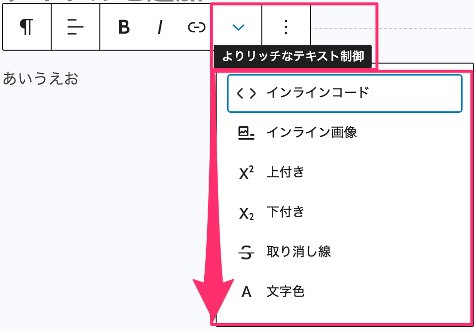
このツールバーに独自のボタンを追加するには、registerFormatType というメソッドを利用すれば可能になりますが、そのままではツールバーの右端の「よりリッチなテキスト制御」ツールバーのドロップダウンに集約されてしまい、アクセスしづらいです。
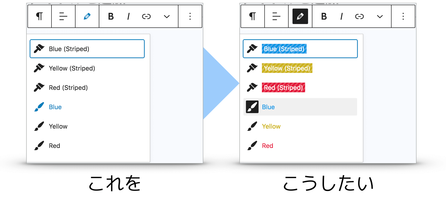
また、多数のボタン(装飾)を追加する場合は、「文字色」、「文字サイズ」などでグループ分けして独立したツールバーボタンにそれぞれドロップダウンメニューに追加するほうがスッキリします。
というわけで、今回は簡単に独自のリッチテキストツールバーボタンの追加と、さらにその中に任意の選択中の文字列に対して複数の class の挿入にも対応したドロップダウンメニューの登録方法を紹介します。
開発環境を用意する
WordPress がローカル環境にない場合は、まずは「LOCAL」などのアプリケーションを利用してローカル環境に WordPress をセットアップしておきます。
ローカルにWordPressを構築

 Local
LocalWordPress のブロックエディター開発には、本来は React、Webpack など様々なモジュールやライブラリ環境を事前に整える必要がありますが、WordPress が公式で提供している以下の「Create Block」を利用すれば、数行コマンドを実行するだけで、オリジナルブロックを追加するための開発環境を、難しくて複雑なセットアップ作業をすべて省いて瞬時に構築できます。
Node.js v.10.0.0 以降と npm v.6.9.0 以降だけは事前にインストールしておきます。
Create Block

コマンドからローカルの WordPress のプラグインフォルダに移動してから以下のコマンドを実行すると、すぐにブロックエディターの開発環境が WordPress プラグインとしてセットアップされます。
npx @wordpress/create-block my-custom-block
cd my-custom-block
npm start
上記では、”my-custom-block” というスラッグでプラグイン(開発環境)を作成しています。
/wp-content/plugins に「my-custom-block」というフォルダが作成され、このフォルダに移動しておきます。
モニタリング状態(npm start)を解除するには、Command (Windowsは Ctrl ) + C を押します。
次に、プラグインフォルダ内に以下のフォルダとファイルを手動で作成しておきます。
専用のコンポーネントを作成
開発環境が整ったら、リッチテキストにオリジナルツールバーとドロップダウンメニューを追加するためのコーディング作業をしていきます。
オリジナルのフォーマットタイプ生成メソッドを用意
WordPress ネイティブの registerFormatType メソッドでは、スペースで区切られた複数の class の受け渡しには対応できない(フィルターでひっかかってしまう)ため、元の registerFormatType から class 名に半角スペースがあってもフィルタリングしないよう修正したメソッドを用意します。
import { select, dispatch } from '@wordpress/data';

export function myRegisterFormatType( name, settings ) {
	settings = {
		name,
		...settings,
	};

	if ( typeof settings.name !== 'string' ) {
		window.console.error( 'Format names must be strings.' );
		return;
	}

	if ( ! /^[a-z][a-z0-9-]*\/[a-z][a-z0-9-]*$/.test( settings.name ) ) {
		window.console.error(
			'Format names must contain a namespace prefix, include only lowercase alphanumeric characters or dashes, and start with a letter. Example: my-plugin/my-custom-format'
		);
		return;
	}

	if ( select( 'core/rich-text' ).getFormatType( settings.name ) ) {
		window.console.error(
			'Format "' + settings.name + '" is already registered.'
		);
		return;
	}

	if ( typeof settings.tagName !== 'string' || settings.tagName === '' ) {
		window.console.error( 'Format tag names must be a string.' );
		return;
	}

	if (
		( typeof settings.className !== 'string' ||
			settings.className === '' ) &&
		settings.className !== null
	) {
		window.console.error(
			'Format class names must be a string, or null to handle bare elements.'
		);
		return;
	}


	// 半角スペースで区切った複数の class を許可するよう変更

	// if ( ! /^[_a-zA-Z]+[a-zA-Z0-9-]*$/.test( settings.className ) ) {
	if ( ! /^([_a-zA-Z]+[a-zA-Z0-9-]*)(\s+[_a-zA-Z]+[a-zA-Z0-9-]*)*$/.test( settings.className ) ) {
		window.console.error(
			'A class name must begin with a letter, followed by any number of hyphens, letters, or numbers.'
		);
		return;
	}

	if ( settings.className === null ) {
		const formatTypeForBareElement = select(
			'core/rich-text'
		).getFormatTypeForBareElement( settings.tagName );

		if ( formatTypeForBareElement ) {
			window.console.error(
				`Format "${ formatTypeForBareElement.name }" is already registered to handle bare tag name "${ settings.tagName }".`
			);
			return;
		}
	} else {
		const formatTypeForClassName = select(
			'core/rich-text'
		).getFormatTypeForClassName( settings.className );

		if ( formatTypeForClassName ) {
			window.console.error(
				`Format "${ formatTypeForClassName.name }" is already registered to handle class name "${ settings.className }".`
			);
			return;
		}
	}

	if ( ! ( 'title' in settings ) || settings.title === '' ) {
		window.console.error(
			'The format "' + settings.name + '" must have a title.'
		);
		return;
	}

	if ( 'keywords' in settings && settings.keywords.length > 3 ) {
		window.console.error(
			'The format "' +
				settings.name +
				'" can have a maximum of 3 keywords.'
		);
		return;
	}

	if ( typeof settings.title !== 'string' ) {
		window.console.error( 'Format titles must be strings.' );
		return;
	}

	dispatch( 'core/rich-text' ).addFormatTypes( settings );

	return settings;
}
オリジナルのドロップダウンメニュー用メソッドを用意
ネイティブの DropdownMenu メソッドでは、カーソルがあるテキストがドロップダウンメニュー内にある装飾(class)に該当するとき、いわばドロップダウンメニュー(子)の親であるツールバーボタンにその情報を伝達する手段がありません。
さらに、各ドロップダウンメニューに割り当てられている実際の装飾(CSS)はメニュータイトルに反映されるわけではないため、実際に選択したテキストにどんなスタイル(CSS)が反映されるのかがわかりません。
これらの課題を解決するために、ネイティブのソースを元にドロップダウンメニュー用のメソッドも自作してみます。
/**
 * External dependencies
 */
import classnames from 'classnames';
import { flatMap, isEmpty, isFunction } from 'lodash';

/**
 * WordPress dependencies
 */
import { DOWN } from '@wordpress/keycodes';
import deprecated from '@wordpress/deprecated';
import { Button, Dropdown, NavigableMenu } from '@wordpress/components';


function mergeProps( defaultProps = {}, props = {} ) {
	const mergedProps = {
		...defaultProps,
		...props,
	};

	if ( props.className && defaultProps.className ) {
		mergedProps.className = classnames(
			props.className,
			defaultProps.className
		);
	}

	return mergedProps;
}

/**
 * オリジナルのドロップダウンメニュー
 */
function MyDropdownMenu( {
	children,
	className,
	controls,
	icon = 'menu',
	label,
	popoverProps,
	toggleProps,
	menuProps,
	disableOpenOnArrowDown = false,
	// The following props exist for backward compatibility.
	menuLabel,
	position,
	noIcons,
} ) {

	if ( menuLabel ) {
		deprecated( '`menuLabel` prop in `DropdownComponent`', {
			alternative: '`menuProps` object and its `aria-label` property',
			plugin: 'Gutenberg',
		} );
	}

	if ( position ) {
		deprecated( '`position` prop in `DropdownComponent`', {
			alternative: '`popoverProps` object and its `position` property',
			plugin: 'Gutenberg',
		} );
	}

	if ( isEmpty( controls ) && ! isFunction( children ) ) {
		return null;
	}

	// Normalize controls to nested array of objects (sets of controls)
	let controlSets;
	if ( ! isEmpty( controls ) ) {
		controlSets = controls;
		if ( ! Array.isArray( controlSets[ 0 ] ) ) {
			controlSets = [ controlSets ];
		}
	}
	const mergedPopoverProps = mergeProps(
		{
			className: 'components-dropdown-menu__popover',
			position,
		},
		popoverProps
	);

	// フォーカスされた文字列に該当する装飾が適用されているか
	let isNoActiveAll = true
	controlSets.map( ( controlSet, indexOfSet ) => (

		isNoActiveAll = _.every( controlSet, function( control ) {
		  return control.isActive == false
		} )
	) )

	return (
		<Dropdown
			className={ classnames( 'components-dropdown-menu', className ) }
			popoverProps={ mergedPopoverProps }
			renderToggle={ ( { isOpen, onToggle } ) => {
				const openOnArrowDown = ( event ) => {
					if ( disableOpenOnArrowDown ) {
						return;
					}

					if ( ! isOpen && event.keyCode === DOWN ) {
						event.preventDefault();
						event.stopPropagation();
						onToggle();
					}
				};
				const mergedToggleProps = mergeProps(
					{
						className: classnames(
							'components-dropdown-menu__toggle',
							{
								'is-opened': isOpen,
							}
						),
					},
					toggleProps
				);

				return (
					<Button
						{ ...mergedToggleProps }

						// 子(ドロップダウンメニュー)がフォーカスされた文字列に該当する装飾をもつ場合は、is-pressed を追加
						className={
							classnames([
									'components-icon-button components-toolbar__control'
								],
								{
									'is-pressed' : ! isNoActiveAll,
								}
							)
						}

						icon={ icon }
						onClick={ ( event ) => {
							onToggle( event );
							if ( mergedToggleProps.onClick ) {
								mergedToggleProps.onClick( event );
							}
						} }
						onKeyDown={ ( event ) => {
							openOnArrowDown( event );
							if ( mergedToggleProps.onKeyDown ) {
								mergedToggleProps.onKeyDown( event );
							}
						} }
						aria-haspopup="true"
						aria-expanded={ isOpen }
						label={ label }
						showTooltip
					>
						{ mergedToggleProps.children }
					</Button>
				);
			} }
			renderContent={ ( props ) => {
				const mergedMenuProps = mergeProps(
					{
						'aria-label': menuLabel || label,
						className: classnames(
							'components-dropdown-menu__menu',
							{ 'no-icons': noIcons }
						),
					},
					menuProps
				);

				return (
					<NavigableMenu { ...mergedMenuProps } role="menu">
						{ isFunction( children ) ? children( props ) : null }
						{ flatMap( controlSets, ( controlSet, indexOfSet ) =>
							controlSet.map( ( control, indexOfControl ) => (
								<Button
									key={ [
										indexOfSet,
										indexOfControl,
									].join() }
									onClick={ ( event ) => {
										event.stopPropagation();
										props.onClose();
										if ( control.onClick ) {
											control.onClick();
										}
									} }
									className={ classnames(
										'components-dropdown-menu__menu-item',
										{
											'has-separator':
												indexOfSet > 0 &&
												indexOfControl === 0,
											'is-active': control.isActive,
										}
									) }
									icon={ control.icon }
									aria-checked={
										control.role === 'menuitemcheckbox' ||
										control.role === 'menuitemradio'
											? control.isActive
											: undefined
									}
									role={
										control.role === 'menuitemcheckbox' ||
										control.role === 'menuitemradio'
											? control.role
											: 'menuitem'
									}
									disabled={ control.isDisabled }
								>
									{ /* control.title */ }
									<span className={ `dropdown-item-title ${ control.formatClass }` }>
										{ control.title }
									</span>
								</Button>
							) )
						) }
					</NavigableMenu>
				);
			} }
		/>
	);
}

export default MyDropdownMenu;
修正箇所は、isNoActiveAll というフラグを用意し、包括するドロップダウンメニュー内にアクティブな状態( isActive = true )のアイテムが1つでもある場合は、isNoActiveAll を false にする処理を追加しています。
// フォーカスされた文字列に該当する装飾が適用されているか
let isNoActiveAll = true
controlSets.map( ( controlSet, indexOfSet ) => (
	isNoActiveAll = _.every( controlSet, function( control ) {
		return control.isActive == false
	} )
) )
isNoActiveAll が false の場合は、ツールバーボタン(.components-button)に is-pressed セレクタを挿入するようにします。
そうすると WordPress の CSS によりボタンが反転します。
<Button
	{ ...mergedToggleProps }

	// 子(ドロップダウンメニュー)がフォーカスされた文字列に該当する装飾をもつ場合は、is-pressed を追加
	className={
		classnames([
				'components-icon-button components-toolbar__control'
			],
			{
				'is-pressed' : ! isNoActiveAll,
			}
		)
	}

	icon={ icon }
	onClick={ ( event ) => {
		onToggle( event );
		if ( mergedToggleProps.onClick ) {
			mergedToggleProps.onClick( event );
		}
	} }
	onKeyDown={ ( event ) => {
		openOnArrowDown( event );
		if ( mergedToggleProps.onKeyDown ) {
			mergedToggleProps.onKeyDown( event );
		}
	} }
	aria-haspopup="true"
	aria-expanded={ isOpen }
	label={ label }
	showTooltip
>
	{ mergedToggleProps.children }
</Button>
最後の修正箇所は、ドロップダウンメニューの各アイテムのタイトルには、対象となる装飾スタイル(CSS)を反映した状態にするため、<Button …>{ control.title }</Button> で括られているタイトル部分を以下のようにして、装飾用のセレクタを持つ span 要素でラップしておきます。
<span className={ `dropdown-item-title ${ control.formatClass }` }>
	{ control.title }
</span>
外部からの呼び出し先となるコンポーネントを用意
独自のツールバーボタンとドロップダウンメニューの実体はここまでで完成したので、あとはこれらを利用して独自のツールバーとドロップダウンメニューを生成する橋渡しとなるコンポーネント(MyCustomToolbarDropdownMenu)を用意します。
/**
 * オリジナルのリッチテキストツールバーボタン
 */
export function MyRichTextToolbarButton( { name, shortcutType, shortcutCharacter, ...props } ) {
	let shortcut;
	let fillName = 'MyRichText.ToolbarControls';

	if ( name ) {
		fillName += `.${ name }`;
	}

	if ( shortcutType && shortcutCharacter ) {
		shortcut = displayShortcut[ shortcutType ]( shortcutCharacter );
	}

	return (
		<Fill name={ fillName }>
			<ToolbarButton
				{ ...props }
				shortcut={ shortcut }
			/>
		</Fill>
	);
}


/**
 * オリジナルのリッチテキストツールバードロップダウンメニュー
 */
export const MyCustomToolbarDropdownMenu = ( props ) => {

	const {
		formatTypeName,
		slotName,
		toolbarClass,
		toolbarIcon,
		toolbarLabel,
		dropdownPosition,
		childButtons,
	} = props

	if ( !formatTypeName ) return;
	if ( !childButtons ) return;


	// 専用のドロップダウンボタンとメニューを登録
	myRegisterFormatType(
		formatTypeName,
		{
			title: 'buttons',
			tagName: 'dropdown',
			className: toolbarClass ? `my-toolbar-controls-${toolbarClass}` : null,

			edit( { isActive, value, onChange } ) {

				return (
					<BlockFormatControls>
						<div className="editor-format-toolbar block-editor-format-toolbar my-components-toolbar">
							<Toolbar>
								<Slot name={ `MyRichText.ToolbarControls.${ slotName }` }>
									{ (fills) => fills.length !== 0 &&

										// オリジナルのドロップダウンメニューとして出力
										<MyDropdownMenu
											icon={ toolbarIcon || 'admin-customizer' }
											label={ toolbarLabel }
											hasArrowIndicator={ true }
											popoverProps={ {
												position: dropdownPosition,
											} }
											controls={ fills.map( ( [ { props } ] ) => props ) }
										/>
									}
								</Slot>
							</Toolbar>
						</div>
					</BlockFormatControls>
	            );
	        }
	    }
    );


	// オリジナルのリッチテキストツールバーボタン(子)への追加
	childButtons.map( (idx) => {
		let type = 'my-toolbar/richtext-' + idx.tag;

		// 複数のclassのときはスペースをハイフン(-)にして連結
		if ( idx.class !== null ){
			type += '-' + idx.class.replace( /\s/, '-');
		}

		myRegisterFormatType( type, {
			title: idx.title,
			tagName: idx.tag,
			className: idx.class,

			edit( { isActive, value, onChange } ) {
				return (
					<Fragment>
						{
							// RichTextToolbarButton から MyRichTextToolbarButton へ登録先変更(専用のドロップダウンボタンができる)
						}
						<MyRichTextToolbarButton
							name={ slotName }	// Slot name
							icon={ idx.icon ? idx.icon : null }
							title={ idx.title }
							formatClass={ idx.class }
							isActive={ isActive }
							onClick={ () => onChange( toggleFormat( value, { type: type } ) ) }
						/>
					</Fragment>
				);
			},
		} );
	} );
}
エディター用の CSS を用意(任意)
この独自のツールバーボタンとドロップメニュー用にデザインを調整したい場合は、「components」フォルダ内に作成しておいた “editor.scss” に記述しておきます。
拡張子の通り、SCSS としてコーディングできるので、とても楽です。
.my-components-dropdown-menu__menu{
	.components-button{
		&.is-active{
			background-color:rgba(#000,.06);
		}
	}
}
まとめ
ここまで作成した処理を「components」フォルダの “my-custom-toolbar-dropdown-menu.js” にまとめたものがこちら。
// エディター用のCSS
import './editor.scss';

/**
 * External dependencies
 */
import classnames from 'classnames';
import { flatMap, isEmpty, isFunction } from 'lodash';

/**
 * WordPress dependencies
 */
import { Fragment } from '@wordpress/element';
import { select, dispatch } from '@wordpress/data';
import { DOWN, displayShortcut } from '@wordpress/keycodes';
import { Fill, Slot, Button, Toolbar, ToolbarButton, Dropdown, NavigableMenu } from '@wordpress/components';
import { deprecated } from '@wordpress/deprecated';
import { BlockFormatControls } from '@wordpress/block-editor';
import { toggleFormat } from '@wordpress/rich-text';


/**
 * @typedef {Object} WPFormat
 *
 * @property {string}   name        A string identifying the format. Must be
 *                                  unique across all registered formats.
 * @property {string}   tagName     The HTML tag this format will wrap the
 *                                  selection with.
 * @property {string}   [className] A class to match the format.
 * @property {string}   title       Name of the format.
 * @property {Function} edit        Should return a component for the user to
 *                                  interact with the new registered format.
 */

/**
 * Registers a new format provided a unique name and an object defining its
 * behavior.
 *
 * @param {string}   name                 Format name.
 * @param {WPFormat} settings             Format settings.
 *
 * @return {WPFormat|undefined} The format, if it has been successfully registered;
 *                              otherwise `undefined`.
 *
 * @see https://github.com/WordPress/gutenberg/blob/master/packages/rich-text/src/register-format-type.js
 */
export function myRegisterFormatType( name, settings ) {
	settings = {
		name,
		...settings,
	};

	if ( typeof settings.name !== 'string' ) {
		window.console.error( 'Format names must be strings.' );
		return;
	}

	if ( ! /^[a-z][a-z0-9-]*\/[a-z][a-z0-9-]*$/.test( settings.name ) ) {
		window.console.error(
			'Format names must contain a namespace prefix, include only lowercase alphanumeric characters or dashes, and start with a letter. Example: my-plugin/my-custom-format'
		);
		return;
	}

	if ( select( 'core/rich-text' ).getFormatType( settings.name ) ) {
		window.console.error(
			'Format "' + settings.name + '" is already registered.'
		);
		return;
	}

	if ( typeof settings.tagName !== 'string' || settings.tagName === '' ) {
		window.console.error( 'Format tag names must be a string.' );
		return;
	}

	if (
		( typeof settings.className !== 'string' ||
			settings.className === '' ) &&
		settings.className !== null
	) {
		window.console.error(
			'Format class names must be a string, or null to handle bare elements.'
		);
		return;
	}


	/**
	 * 半角スペースで区切った複数の class を許可するよう変更
	 */
	// if ( ! /^[_a-zA-Z]+[a-zA-Z0-9-]*$/.test( settings.className ) ) {
	if ( ! /^([_a-zA-Z]+[a-zA-Z0-9-]*)(\s+[_a-zA-Z]+[a-zA-Z0-9-]*)*$/.test( settings.className ) ) {
		window.console.error(
			'A class name must begin with a letter, followed by any number of hyphens, letters, or numbers.'
		);
		return;
	}

	if ( settings.className === null ) {
		const formatTypeForBareElement = select(
			'core/rich-text'
		).getFormatTypeForBareElement( settings.tagName );

		if ( formatTypeForBareElement ) {
			window.console.error(
				`Format "${ formatTypeForBareElement.name }" is already registered to handle bare tag name "${ settings.tagName }".`
			);
			return;
		}
	} else {
		const formatTypeForClassName = select(
			'core/rich-text'
		).getFormatTypeForClassName( settings.className );

		if ( formatTypeForClassName ) {
			window.console.error(
				`Format "${ formatTypeForClassName.name }" is already registered to handle class name "${ settings.className }".`
			);
			return;
		}
	}

	if ( ! ( 'title' in settings ) || settings.title === '' ) {
		window.console.error(
			'The format "' + settings.name + '" must have a title.'
		);
		return;
	}

	if ( 'keywords' in settings && settings.keywords.length > 3 ) {
		window.console.error(
			'The format "' +
				settings.name +
				'" can have a maximum of 3 keywords.'
		);
		return;
	}

	if ( typeof settings.title !== 'string' ) {
		window.console.error( 'Format titles must be strings.' );
		return;
	}

	dispatch( 'core/rich-text' ).addFormatTypes( settings );

	return settings;
}


function mergeProps( defaultProps = {}, props = {} ) {
	const mergedProps = {
		...defaultProps,
		...props,
	};

	if ( props.className && defaultProps.className ) {
		mergedProps.className = classnames(
			props.className,
			defaultProps.className
		);
	}

	return mergedProps;
}

/**
 * オリジナルのドロップダウンメニュー
 *
 * @see https://github.com/WordPress/gutenberg/blob/d6c5c5b063fcef5c6d82408af3f8a28c39c88c6f/packages/components/src/dropdown-menu/index.js
 */
function MyDropdownMenu( {
	children,
	className,
	controls,
	icon = 'menu',
	label,
	popoverProps,
	toggleProps,
	menuProps,
	disableOpenOnArrowDown = false,
	// The following props exist for backward compatibility.
	menuLabel,
	position,
	noIcons,
} ) {

	if ( menuLabel ) {
		deprecated( '`menuLabel` prop in `DropdownComponent`', {
			alternative: '`menuProps` object and its `aria-label` property',
			plugin: 'Gutenberg',
		} );
	}

	if ( position ) {
		deprecated( '`position` prop in `DropdownComponent`', {
			alternative: '`popoverProps` object and its `position` property',
			plugin: 'Gutenberg',
		} );
	}

	if ( isEmpty( controls ) && ! isFunction( children ) ) {
		return null;
	}

	// Normalize controls to nested array of objects (sets of controls)
	let controlSets;
	if ( ! isEmpty( controls ) ) {
		controlSets = controls;
		if ( ! Array.isArray( controlSets[ 0 ] ) ) {
			controlSets = [ controlSets ];
		}
	}
	const mergedPopoverProps = mergeProps(
		{
			className: 'components-dropdown-menu__popover',
			position,
		},
		popoverProps
	);

	// フォーカスされた文字列に該当する装飾が適用されているか
	let isNoActiveAll = true
	controlSets.map( ( controlSet, indexOfSet ) => (

		isNoActiveAll = _.every( controlSet, function( control ) {
		  return control.isActive == false
		} )
	) )

	return (
		<Dropdown
			className={ classnames( 'components-dropdown-menu', className ) }
			popoverProps={ mergedPopoverProps }
			renderToggle={ ( { isOpen, onToggle } ) => {
				const openOnArrowDown = ( event ) => {
					if ( disableOpenOnArrowDown ) {
						return;
					}

					if ( ! isOpen && event.keyCode === DOWN ) {
						event.preventDefault();
						event.stopPropagation();
						onToggle();
					}
				};
				const mergedToggleProps = mergeProps(
					{
						className: classnames(
							'components-dropdown-menu__toggle',
							{
								'is-opened': isOpen,
							}
						),
					},
					toggleProps
				);

				return (
					<Button
						{ ...mergedToggleProps }

						// 子(ドロップダウンメニュー)がフォーカスされた文字列に該当する装飾をもつ場合は、is-pressed を追加
						className={
							classnames([
									'components-icon-button components-toolbar__control'
								],
								{
									'is-pressed' : ! isNoActiveAll,
								}
							)
						}

						icon={ icon }
						onClick={ ( event ) => {
							onToggle( event );
							if ( mergedToggleProps.onClick ) {
								mergedToggleProps.onClick( event );
							}
						} }
						onKeyDown={ ( event ) => {
							openOnArrowDown( event );
							if ( mergedToggleProps.onKeyDown ) {
								mergedToggleProps.onKeyDown( event );
							}
						} }
						aria-haspopup="true"
						aria-expanded={ isOpen }
						label={ label }
						showTooltip
					>
						{ mergedToggleProps.children }
					</Button>
				);
			} }
			renderContent={ ( props ) => {
				const mergedMenuProps = mergeProps(
					{
						'aria-label': menuLabel || label,
						className: classnames(
							'components-dropdown-menu__menu',
							{ 'no-icons': noIcons }
						),
					},
					menuProps
				);

				return (
					<NavigableMenu { ...mergedMenuProps } role="menu">
						{ isFunction( children ) ? children( props ) : null }
						{ flatMap( controlSets, ( controlSet, indexOfSet ) =>
							controlSet.map( ( control, indexOfControl ) => (
								<Button
									key={ [
										indexOfSet,
										indexOfControl,
									].join() }
									onClick={ ( event ) => {
										event.stopPropagation();
										props.onClose();
										if ( control.onClick ) {
											control.onClick();
										}
									} }
									className={ classnames(
										'components-dropdown-menu__menu-item',
										{
											'has-separator':
												indexOfSet > 0 &&
												indexOfControl === 0,
											'is-active': control.isActive,
										}
									) }
									icon={ control.icon }
									aria-checked={
										control.role === 'menuitemcheckbox' ||
										control.role === 'menuitemradio'
											? control.isActive
											: undefined
									}
									role={
										control.role === 'menuitemcheckbox' ||
										control.role === 'menuitemradio'
											? control.role
											: 'menuitem'
									}
									disabled={ control.isDisabled }
								>
									{ /* control.title */ }
									<span className={ `dropdown-item-title ${ control.formatClass }` }>
										{ control.title }
									</span>
								</Button>
							) )
						) }
					</NavigableMenu>
				);
			} }
		/>
	);
}

export default MyDropdownMenu;


/**
 * オリジナルのリッチテキストツールバーボタン
 *
 * @see https://github.com/WordPress/gutenberg/blob/master/packages/block-editor/src/components/rich-text/toolbar-button.js
 */
export function MyRichTextToolbarButton( { name, shortcutType, shortcutCharacter, ...props } ) {
	let shortcut;
	let fillName = 'MyRichText.ToolbarControls';

	if ( name ) {
		fillName += `.${ name }`;
	}

	if ( shortcutType && shortcutCharacter ) {
		shortcut = displayShortcut[ shortcutType ]( shortcutCharacter );
	}

	return (
		<Fill name={ fillName }>
			<ToolbarButton
				{ ...props }
				shortcut={ shortcut }
			/>
		</Fill>
	);
}


/**
 * オリジナルのリッチテキストツールバードロップダウンメニュー
 */
export const MyCustomToolbarDropdownMenu = ( props ) => {

	const {
		formatTypeName,
		slotName,
		toolbarClass,
		toolbarIcon,
		toolbarLabel,
		dropdownPosition,
		childButtons,
	} = props

	if ( !formatTypeName ) return;
	if ( !childButtons ) return;


	// 専用のドロップダウンボタンとメニューを登録
	myRegisterFormatType(
		formatTypeName,
		{
			title: 'buttons',
			tagName: 'dropdown',
			className: toolbarClass ? `my-toolbar-controls-${toolbarClass}` : null,

			edit( { isActive, value, onChange } ) {

				return (
					<BlockFormatControls>
						<div className="editor-format-toolbar block-editor-format-toolbar my-components-toolbar">
							<Toolbar>
								<Slot name={ `MyRichText.ToolbarControls.${ slotName }` }>
									{ (fills) => fills.length !== 0 &&

										// オリジナルのドロップダウンメニューとして出力
										<MyDropdownMenu
											icon={ toolbarIcon || 'admin-customizer' }
											label={ toolbarLabel }
											hasArrowIndicator={ true }
											popoverProps={ {
												position: dropdownPosition,
											} }
											controls={ fills.map( ( [ { props } ] ) => props ) }
										/>
									}
								</Slot>
							</Toolbar>
						</div>
					</BlockFormatControls>
	            );
	        }
	    }
    );


	// オリジナルのリッチテキストツールバーボタン(子)への追加
	childButtons.map( (idx) => {
		let type = 'my-toolbar/richtext-' + idx.tag;

		// 複数のclassのときはスペースをハイフン(-)にして連結
		if ( idx.class !== null ){
			type += '-' + idx.class.replace( /\s/, '-');
		}

		myRegisterFormatType( type, {
			title: idx.title,
			tagName: idx.tag,
			className: idx.class,

			edit( { isActive, value, onChange } ) {
				return (
					<Fragment>
						{
							// RichTextToolbarButton から MyRichTextToolbarButton へ登録先変更(専用のドロップダウンボタンができる)
						}
						<MyRichTextToolbarButton
							name={ slotName }	// Slot name
							icon={ idx.icon ? idx.icon : null }
							title={ idx.title }
							formatClass={ idx.class }
							isActive={ isActive }
							onClick={ () => onChange( toggleFormat( value, { type: type } ) ) }
						/>
					</Fragment>
				);
			},
		} );
	} );
}
独自のドロップダウンメニューを登録
あとは、作成した “MyCustomToolbarDropdownMenu” コンポーネントを呼び出して、追加したいツールバーとドロップダウンメニューに必要な情報を渡せば、リッチテキストツールバーに追加したいだけドロップダウンメニューを登録できます。
装飾用のCSSを作成
ドロップダウンメニューのアイテムごとに割り当てるテキスト装飾用の CSS を用意しておきます。
CSS(scss)は、最初に作成しておいた「dropdown-menu」→「text-color」フォルダにある “style.scss” に記述します。
今回のサンプルでは、適当に赤、青、黄のフォントカラー3色と、そのハイライト分の合計6パターンのスタイルを用意しておきます。
.is-text-blue{
	color:#0693e3;
	&.is-stripe{
		background-color:#0693e3;
	}
}

.is-text-yellow{
	color:#cbb11b;
	&.is-stripe{
		background-color:#cbb11b;
	}
}

.is-text-red{
	color:#e21438;
	&.is-stripe{
		background-color:#e21438;
	}
}

[class*="is-text-"]{
	&.is-stripe{
		padding:2px 4px;
		color:#fff;
		background-image:repeating-linear-gradient(135deg, transparent, transparent 3px, rgba(255,255,255,0.18) 3px, rgba(255,255,255,0.18) 6px);
	}
}
ドロップダウンメニューアイテムの定義
配列にドロップダウンメニューの各アイテムご登録必要な情報をまとめておきます。
ドロップダウンメニューアイテム(配列)の書式
ドロップダウンメニューのアイテム(配列)は、以下の書式で定義します。
{
	// ラッパー要素(HTMLタグ)
	tag: 'span',
	// 挿入する class(複数可)
	class: 'is-text-blue is-stripe',
	// メニュータイトル
	title: __( 'Blue Text' ),
	// アイコン(ダッシュアイコン、または svg でも可)
	icon: 'admin-appearance',
}
ドロップダウンメニューの左端に表示されるアイコン(icon)は、WordPress のダッシュアイコンであれば、そのアイコン名(dashicons を省いたもの)の文字列か、オリジナルのアイコンで表示したい場合はコンポーネント化した svg を直接渡してもOKです。
今回のサンプルの 赤、青、黄の文字色を装飾するドロップダウンメニューを作る場合は以下のように配列にまとめます。
// 登録するドロップダウンメニューアイテム
const tags = [];

// 複数classを持つ方を先に記述
tags.push( {
	tag: 'span',
	class: 'is-text-blue is-stripe',
	title: sprintf( '%s (%s)', __('Blue', 'create-block'), __('Striped', 'create-block') ),
	icon: 'admin-appearance',
} );
tags.push( {
	tag: 'span',
	class: 'is-text-yellow is-stripe',
	title: sprintf( '%s (%s)', __('Yellow', 'create-block'), __('Striped', 'create-block') ),
	icon: 'admin-appearance',
} );
tags.push( {
	tag: 'span',
	class: 'is-text-red is-stripe',
	title: sprintf( '%s (%s)', __('Red', 'create-block'), __('Striped', 'create-block') ),
	icon: 'admin-appearance',
} );
tags.push( {
	tag: 'span',
	class: 'is-text-blue',
	title: __('Blue', 'create-block'),
	icon: 'admin-customizer',
} );
tags.push( {
	tag: 'span',
	class: 'is-text-yellow',
	title: __('Yellow', 'create-block'),
	icon: 'admin-customizer',
} );
tags.push( {
	tag: 'span',
	class: 'is-text-red',
	title: __('Red', 'create-block'),
	icon: 'admin-customizer',
} );
追加したい class の数だけ、配列(tags)に追加しておきます。
複数のセレクタ(class)がある場合は、先に定義して配列に追加しておきます。
ツールバーに独自のドロップダウンメニューを登録
最後にドロップダウンメニューの内容をまとめた配列と共に、独自のツールバーを作成するよう “MyCustomToolbarDropdownMenu” コンポーネントを利用して登録します。
MyCustomToolbarDropdownMenu( {
	// フォーマットタイプ名
	formatTypeName : 'my-custom-block/custom-format-text-color',
	// スロット名
	slotName : 'textColor',
	// ツールバーボタン用のclass
	toolbarClass: 'text-color',
	// ツールバーボタンのアイコン
	toolbarIcon : 'edit',
	// ツールバーボタンのポップアップラベル
	toolbarLabel : __( 'Text Color' ),
	// ドロップダウンメニュー位置 : bottom, top / left, center, right
	dropdownPosition : 'bottom center',
	// 各ドロップダウンメニューの内容(配列)
	childButtons : tags,
} )
まとめ
ここまでの内容を「doropdown-menu」→「text-color」フォルダの “index.js” にまとめたものがこちら。
// 公開用のCSS
import './style.scss';

import {
	__,
	sprintf,
} from '@wordpress/i18n'

import { MyCustomToolbarDropdownMenu } from '../../../components/my-custom-toolbar-dropdown-menu'


// 登録するドロップダウンメニューアイテム
const tags = [];

// 複数classを持つ方を先に記述
tags.push( {
	tag: 'span',
	class: 'is-text-blue is-stripe',
	title: sprintf( '%s (%s)', __('Blue', 'create-block'), __('Striped', 'create-block') ),
	icon: 'admin-appearance',
} );
tags.push( {
	tag: 'span',
	class: 'is-text-yellow is-stripe',
	title: sprintf( '%s (%s)', __('Yellow', 'create-block'), __('Striped', 'create-block') ),
	icon: 'admin-appearance',
} );
tags.push( {
	tag: 'span',
	class: 'is-text-red is-stripe',
	title: sprintf( '%s (%s)', __('Red', 'create-block'), __('Striped', 'create-block') ),
	icon: 'admin-appearance',
} );

tags.push( {
	tag: 'span',
	class: 'is-text-blue',
	title: __('Blue', 'create-block'),
	icon: 'admin-customizer',
} );
tags.push( {
	tag: 'span',
	class: 'is-text-yellow',
	title: __('Yellow', 'create-block'),
	icon: 'admin-customizer',
} );
tags.push( {
	tag: 'span',
	class: 'is-text-red',
	title: __('Red', 'create-block'),
	icon: 'admin-customizer',
} );

/**
 * オリジナルツールバーボタンとドロップダウンメニューの組み込み
 */
MyCustomToolbarDropdownMenu( {
	formatTypeName : 'my-custom-block/custom-format-text-color',
	slotName : 'textColor',
	toolbarClass: 'text-color',
	toolbarIcon : 'edit',
	toolbarLabel : __( 'Text Color' ),
	dropdownPosition : 'bottom center',
	childButtons : tags,
});
最後に、「my-custom-block」→「src」フォルダの “index.js” にこの文字色用のツールバーの内容を import しておきます。
import './dropdown-menu/text-color';
この要領で、「dropdown-menu」フォルダ内に追加したいドロップダウンメニューごとにフォルダとファイルを分けて、メインの index.js に import していくだけで、独自のツールバーボタンを追加してドロップダウンメニューを展開させることができます。
プロジェクトのビルド
最後に、コマンドに戻ってビルドを実行します。
npm run build
正常にビルドが完了すると、プラグインフォルダ直下の「build」フォルダ内にすべてのスクリプトと CSS が集約されたものが出力されます。
あとは、この「My Custom Block」プラグインを有効化してブロックエディターを開くと、リッチテキストツールバーに独自のツールバーボタンとドロップダウンメニューが追加されています。